

Simon Kuestenmacher
@simongerman600
German #geographer# and #demographer# in #Melbourne#. I curate #maps# and #data# that explain how the #world# works. Obviously all opinions are my own...
215K Following 298.3K Followers

@simongerman600 This is just Argentina's flag.

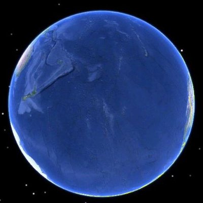
Go back 225 years and the snow-covered footprint of history is much larger than you might expect.
One of the strangest chapters came in 1816 — the “Year Without a Summer” — after the massive eruption of Mount Tambora cooled the planet.
The real surprise is how little of the world is left where snow has never been recorded. 🌍❄️
Show more

The rapid and universal decline of fertility rates across the US remains astonishing.

My six-year-old while sipping water: where does water come from? Ha! Learning opportunity! Time to whip out this chart. Source:

Your coffee has gotten more expensive. US ground coffee prices rose 125% between 2019 and 2026 (compared to only 33% for groceries overall). Bad news don't stop! Source:
Show more

This is either the best or the silliest way to figure out what people think counts as “working class” 🤣

All the red circles on this map have a 500 mile (about 800km) radius. Basic geography knowledge but lots of folks apparently struggle with the logic. On Mercator projections regions closer to the poles appear enlarged. Source:
Show more

Pilots and flight attendants have the highest cancer risk of any occupation. One likely culprit: spending decades at cruising altitude, above much of the atmosphere that normally protects us from cosmic radiation. The study tracked 12.7 million deaths across 503 occupations from 2000 to 2024. The long-term health implications of living on the Moon or in space aren’t rosy based on this data.
Source:
HT @cmdr_hadfield
Show more

Where has snow fallen at any point since 1940?


@simongerman600 from my geodetics course

This animated map shows the population change in Germany (current boundaries) over the last 150 years. Cities display wider than they really are. Every district is one flat block of data, so the round hills are just smoothing. Height is people per area, so a mountain's volume is the actual number of people in it. Blue is below half the national average of 2024. Source:
Show more

Australia on the Equal Earth projection looks like it's in Italics. A cute little #badgeographyjoke#... Yes, I know that if probably centred Australia retains its Mercator shape on an Equal Earth projection too but that would ruin the joke... Source:
Show more

Nice to see Australia singled out

This animated map by @KaranD93 shows the story of human migration. Fun to watch. Still a work in progress as I understand.


Pretty much the same story in New Zealand too.

Where has snow fallen at any point since 1940?
Lady Gaga still in the top 10! This ranking feels very 2010 😉

The US is a divided country. The Waffle House Line divides the nation into a syrupy southern paradise and a dry waffle-free north. Source:

Since pre-pandemic times (2019) US corporate profits grew by 52% while wages went up a mere 12 %. Goes a long way in explaining the pent up anger and dissatisfaction in the population I’d say…
Show more

Wow, 88 of the last 89 men's singles tennis Grand Slams have been won by Europeans. The 2010s only saw European Grand Slam champions for the men. HT @LevAkabas